

Items 0
Total Price
Loyalty Points
When it comes to framing your chosen piece of artwork for presentation, there are several elements that you need to take into consideration.
Successful framing all comes down to the following elements:
Here is what you need to consider below when you are next choosing a frame for your art.
When it comes to most things in life, creating the right balance or finding a happy medium is extremely important. With picture framing, it is no different!
Let's try and put this into some kind of analogy... For example, if you were to see an elephant riding a tiny bike, then, to many people, it would look funny and out of place. Using this principle, if you were to frame your artwork without considering the right scales and proportions then, like the elephant on the bike, it too will look odd and out of place.
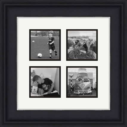
The types of scaling for frames can be determined by the artwork. Let's just say that you have a piece of artwork that is visually strong and very bold with lots of striking colours and textures. The ideal frame for this would be a robust-looking frame with thicker edges so it doesn't get lost in dramatic visuals of the painting.
On the other side of the coin, if you have a delicate piece of art like a watercolour painting with soft shapes and colours for instance, then a more plain and thinner frame will be needed so it doesn't take too much attention away from the artwork.
As we are sure you know, all woods have different grain types and textures, and this will have a significant effect on the finished frame look so it's crucial that you choose the right material of frame to suit your artwork.
The best way to get the right texture and pattern for your artwork is to use the artwork itself for inspiration. Quite often, you can tastefully mimic the textures and patterns of the artwork in the materials used for the frame. Strong images can be nicely complemented by a large strongly detailed frame. In contrast, softer artworks will need a very subtle and well thought out frame.
Simply put, a picture frame should complement the artwork and not draw too much attention away from the image. One of the biggest mistakes made is when people opt to use frames that draw too much attention away, which almost turns the frame into its own individual art piece.
One of the most important elements that need to be considered when choosing a picture frame which is, arguably, one of the most important elements is that the actual colour of the frame. The colour of the frame has the biggest impact on the artwork itself.
If you have already made up your mind on choosing a coloured frame over a wooden frame then the best way to enhance the focal point of your artwork is a mat. For example, if you are framing a piece of art that is dark in colour and has more of a moody feel to it then be sure to choose a light-coloured mat. This light colour will serve as a strong contrast and intensify the artwork further. In essence, you need to use a colour that coordinates with your piece.
It's important to strike a balance when selecting the frame that you want to use for your artwork.
If you are looking to add a piece of artwork to a collection that you already have of modern art but your new piece has more of an antique feel to it then you need to look at ways to choose a frame based on the artwork so that it compliments it, but at the same time, fits into the style of your modern collection. Mixing styles of artwork is absolutely fine as long as you remember to select a frame that doesn't take too much attention away from the artwork.
Let the artwork dictate the style and not the other way around! Good luck and let us know how you get on.
Any good framers will be able to show you a vast range of different solutions and advise on what might be the most suitable given the work and its proposed location.
You can contact EasyFrame on 01234 856 501 and / or sales@EasyFrame.co.uk and they'll always chat even if you don't want to buy!
Article Posted: 09/11/2020 12:22:30