

Items 0
Total Price
Loyalty Points
By Paul Dunwell, writing for EasyFrame
� Copyright EasyFrame 2019
In �Frame Academy I� we provided a run-down of essential terminology as a prelude to further �Frame Academy� pieces that have been spanning more complex aspects of the dark art of picture-framing.
In �Frame Academy II� we gave you a step-by-step idiot�s guide to making a picture-frame. It served, alternatively, as a resource to help you understand the processes involved if you go to a 3rd party to have your frames made to your specifications.
In �Frame Academy III� we ambitiously explained how to gild a frame and add an ostentatious touch to framed work that is already precious to you.
In �Frame Academy IV� we retraced our steps a little and asked: �Why would anybody bother with a frame?� And �With so many options to choose from, what sort of framing solution should I be looking for?�
In �Frame Academy V� we examined interesting things to do with old picture-frames.
In �Frame Academy VI� we explained how to choose mount and moulding colours in the context of the work to be framed and the surroundings in which the framed work is to be hung.
In �Frame Academy VII� we outlined how to hang a large and/or heavy artwork.
In �Frame Academy VIII� we focused on hanging your picture at the correct height.
In �Frame Academy IX� we told you how to hang pictures on the stairs so that they look well-arranged.
In �Frame Academy X�, we looked at picture-rails.
And now, in �Frame Academy XI�, the penultimate article in this series, we address what may have hitherto been a more esoteric consideration in that few people could articulate it: �Are there any unspoken rules about frames that make them work?�
You may well already have some frames that really don�t look right. Admittedly they might be functional. And utilitarian. They should be protective. But, in your heart of hearts, you realise that they don�t show off the work they encapsulate as well as they might. This failure could perplex you. So, are there any tips we can give which would intelligently drive your choices if you opt to reframe your work? Yes. Because framing is a bit of an art itself. And we�ve tried to relate those tips here in a logical sequence that will allow you to look at each framed item and say to yourself �Ah! Now I know what�s wrong. And I know how to fix it too!�
It will come as no shock to readers that, by and large, the cost of frames is proportional to their size. But you shouldn�t try and make false economies by going for a frame that�s essentially too wimpy for the work. Or too cramped. So here are some considerations.
Think about the size of the image first. Because you should work from the image outward rather than from the frame inwards. And then think about the size of the medium on which that image is rendered, be it a photograph or an oil-painting. You need to leave plenty of space - which is usually going to be white or, at least, light - around the image to allow for the frame (and the mount within it, assuming that you use one).
Next the aperture in the mount, the window, should be half an inch smaller in height and width than the medium that will lie under it. And, of course, the mount�s external dimensions must be precisely the same as required by the inner dimensions of the frame in which it will lie.
As for the frame, don�t go for something too broad, heavy, fussy or imposing if the artwork is going to be diminished by it. Neither should you frame great work with something altogether too lightweight. The frame, of course, will have to be the same size as the glass. Whichever is cut first forces the other to follow suit. But the frame-size will have to accommodate the print, with or without any mount.
Of course, as well as the internal dimensions of the frame, the external dimensions of the frame will be a consideration. They of course are driven by the breadth of the moulding. You have to ask yourself how broad you might want that to be. And, possibly, the external dimensions of the frame might be driven in part by its surroundings. You have to ask yourself if there is sufficient space on the wall to accommodate a frame built with a broader moulding.
There are three types of mounts. But it is worth realising their USPs:
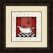
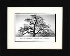
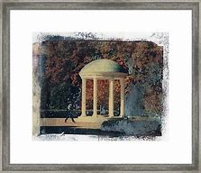
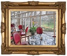
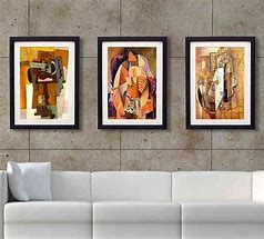
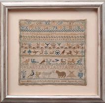
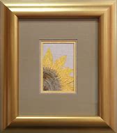
Select frame and mount colours that work with and complement the artwork, the walls on which the artwork is hung, and other items in the room including both hard and soft furnishings, fittings and fixtures. You might opt for a metallic moulding to match nearby light-fittings, for example. And it is worth remembering that dark frames draw the eye to the frame so away from the artwork within it. Darker frames might suit a gloomier painting too. You can go for tints and avoid primary colours or bright white (or, indeed, matt black).
You may use one, two or even three mounts. And there seem to be advantages to the following approach:
Deciding on how many mounts to use and their colours may seem hard. But you can always try using swatches or bits of card. Move them into different configurations. Try every option. Maybe narrow the gap, discarding the worst at each stage until you have a shortlist then the best. Use more than one pair of eyes too. Especially if you�re colour-blind! Meanwhile a good framer will probably be willing to send you some offcuts and make suggestions.
Hanging artwork in great frames is important. If you are framing something precious it�s always worth going straight to a professional framer like EasyFrame for advice. You could have them either do the entire job or help with part of it (whatever has left you racked by self-doubt!) EasyFrame can also certainly supply much of what you need to do the job if you contact them. So they will help you to unify your collection, perhaps by reframing the lot, with picture-hanging hooks and hangers as well as picture mounts and picture frames (and, indeed, lots of paraphernalia that you�d probably not be able to identify let alone recognise even though they use these things every day of the week!)
EasyFrame is on 01234 856 501 and emailable via sales@EasyFrame.co.uk.Article Posted: 24/10/2019 10:51:08