Frame Academy VI
By Paul Dunwell, writing for EasyFrame
� Copyright EasyFrame 2019
What This Article is About
In ?Frame Academy I? we provided a run-down of essential terminology as a prelude to further ?Frame Academy? pieces that are spanning more complex aspects of the
dark art of picture-framing.
In ?Frame Academy II? we gave you a step-by-step idiot?s guide to making a picture frame. It served, alternatively, as a resource to help you understand the processes involved if you go to a 3rd party to have your frames made to your specifications.
In ?Frame Academy III? we ambitiously explained how to gild a frame and add an ostentatious touch to framed work that is already precious to you.
In ?Frame Academy IV? we retraced our steps a little and asked ?Why would anybody bother with a frame?? And ?With so many options to choose from, what sort of framing solution should I be looking for??
In ?Frame Academy V? we examined interesting things to do with old picture-frames.
Now, in Frame Academy VI, we explain how to choose mat and moulding colours in the context of the work to be framed and the surroundings in which the framed work is to be hung.
First Principles
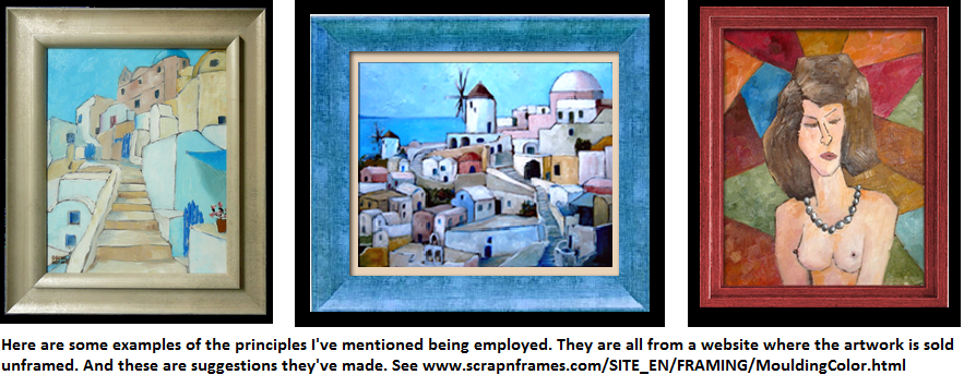
Selecting the right colour or colours is part of doing justice to the artwork that you seek to showcase.
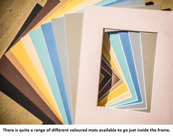
Yet it?s not easy, even if you have good colour sense, to identify the ideal colour for the mat to use behind your artwork, photograph or other exhibit. But a starting-point is that you want something that complements the work rather than upstages it so there?s no distraction. The mat itself should not be the focus. It should not draw the eye in the same way that a bridesmaid (or matron of honour) is not supposed to outshine the bride.
The next thought, after you?ve eliminated the colours that would overwhelm the subject, is to select a colour that?s used somewhere in the work. So look at the constituents of the work, and perhaps moreso at what lies in the background. Somewhere there you might well identify a colour that is present in the work yet available as a mat, one which you feel would work well as a liner to the frame. So you might use a blue from the sky. Or a brown or green from the earth or foliage.
Thirdly you should not be driven by the surroundings in which the work is to be hung. Admittedly you don?t want to be hanging a combination of artwork, mat and frame that will be jarring in their surroundings. But don?t let the location?s colour-scheme achieve a disproportionate importance. In this sense you may well do better to use neutral colours for your mat. And avoid anything that is too close to anything else (including fixtures, fittings etc) in the vicinity of the hanging.
The Appliance of Science
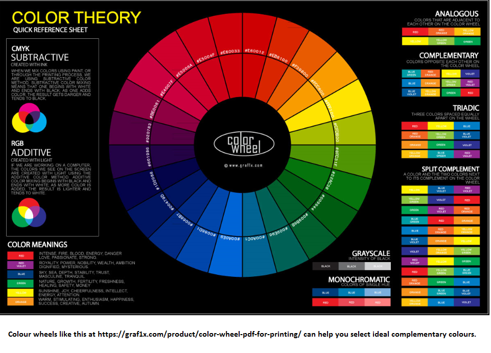
It is definitely worth your looking for a colour wheel if you are stumped for ideas. Colour wheels date from the late 19th century and help to find complementary colours. They are frequently used by professional designers of all kinds. And it makes sense to harness a colour wheel for the purposes of selecting mat and moulding colours. There are lots of free examples online.
Using Black and White
There is absolutely no reason why you have to use colour. Because white mats complement most d?cor. They?re clean. And they?re neutral (white, after all, is not so much the absence of any colours but the presence of all of them). So they are no distraction to the eye. But it is best to avoid snow-white matting which is said to dazzle.
Many framers use white mats with a black core ? a band that is directly outside the artwork. That creates a useful threshold and emboldens the contrast, separating and accentuating the colours of the artwork as well as the colourlessness of the mat. But you could use a grey instead.
Tints and Tones Terminology
Specialists may use terms such as ?colour value? as well as ?tints?, ?shades? and ?tones?. You may well wonder what they mean. Simply put, a colour?s ?value? is where it falls in the black-white spectrum (think monochromatic). ?Tints? are nearer to white. ?Shades? are nearer to black. And anything inbetween is a ?tone?.
Further Considerations with Mats
Some colours are warm. And some are cold. Think of orange (the colour of flames) and blue (associated with ice-floes), for example.
And What of Frame Colours?
It is said that darker frames can help the eye to better appreciate whatever appears to be distant in the artwork. And it is claimed that lighter-coloured frames, meanwhile, allow objects in the foreground to seem more prominent.
Trial it with Technology
There is no reason why you shouldn?t use technology. It is now possible to employ websites to let you see how you?d look in a dress (don?t all rush at once, guys) or a hairdo (likewise). But so far I?ve not seen one which allows you to try different mat and frame colours beside your own artwork. Yet you can easily organise this yourself. Simply photograph your artwork, load it into Microsoft Windows Paint or similar, and try to create a few virtual frames in likely colours.
Where Can You Get More Information?
There are lots of sources for more information on mat and frame colours. One I recommend is at
www.carteravenueframeshop.com/framing-info/framing-design/how-to-choose-mat-colors/ though you?ll note that this is a North American business so you can pick their brains but they?re not well-placed geographically to be easily able to service your needs. Another suggestion is the Artists Network site at
www.artistsnetwork.com/art-techniques/how-to-choose-the-best-frame-to-present-and-protect-your-artwork/ .
Conclusion
Getting mat and frame colours right is important. Not least because you (or somebody else) may well have to live with your choices. And there is no point in having great work that?s poorly-framed.
Meanwhile if you are framing something precious it?s always worth going straight to a professional framer like
EasyFrame for advice. You could have them either do the entire job or help with part of it (whatever has left you jittery!) EasyFrame can also certainly supply much of what you need to do the job if you contact them.
Article Posted: 23/04/2019 11:04:56